Activate any tools
Quick activation of Griffin Unlocker, Chimera, Unlock Tool and many more
Discount on all Smart appliances up to 25%
Shop great deals on MacBook, iPad, iPhone and more.


Popular Tools
The Best Offers
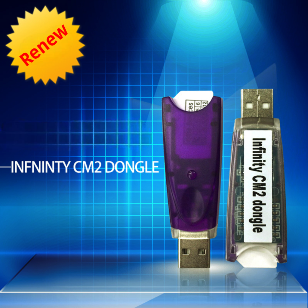
[ Renew CM2 1 Year ] Infinity-Box/Dongle 1 year Updates/Support Renew, Chinese Miracle-2 included (CM2)
In stock
Chimera Tool Premium – 1 Year Activation (5000 Devices)✅
In stock
E-GSM TOOL ACTIVATION [ New Users – Old Users ] 1 Year (Need Register In Tool Before)
In stock
SamKey Samsung Code Reader Credits New Account [MIN 20 Credits]
In stock
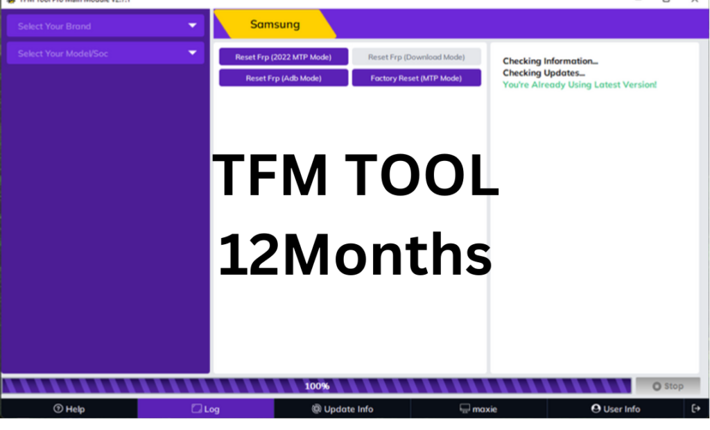
TFM Pro tool 1 Year Activation
In stock

New Goods
[ Renew CM2 1 Year ] Infinity-Box/Dongle 1 year Updates/Support Renew, Chinese Miracle-2 included (CM2)
In stock
[Renew CM2 2 Years] Infinity-Box/Dongle 2 years Updates Support Renewal Chinese Miracle 2 included
In stock
#1235 ICloud Bypass Check If Can By [Mina, IRemove And EMC] (Carrier Locked ON / OFF)
In stock
#225 Sold By Info ⚡ ALL MODELS SUPPORTED (IMEI) FAST
In stock

Apple Shopping Event
Hurry and get discounts on all Apple devices up to 20%
[ Renew CM2 1 Year ] Infinity-Box/Dongle 1 year Updates/Support Renew, Chinese Miracle-2 included (CM2)
[Renew CM2 2 Years] Infinity-Box/Dongle 2 years Updates Support Renewal Chinese Miracle 2 included
#1235 ICloud Bypass Check If Can By [Mina, IRemove And EMC] (Carrier Locked ON / OFF)
#225 Sold By Info ⚡ ALL MODELS SUPPORTED (IMEI) FAST
1278# Google Pixel Warranty/Carrier Check By (MEI)
Home Appliance
[ Renew CM2 1 Year ] Infinity-Box/Dongle 1 year Updates/Support Renew, Chinese Miracle-2 included (CM2)
In stock
[Renew CM2 2 Years] Infinity-Box/Dongle 2 years Updates Support Renewal Chinese Miracle 2 included
In stock
#1235 ICloud Bypass Check If Can By [Mina, IRemove And EMC] (Carrier Locked ON / OFF)
In stock
#225 Sold By Info ⚡ ALL MODELS SUPPORTED (IMEI) FAST
In stock
1278# Google Pixel Warranty/Carrier Check By (MEI)
In stock

Microsoft Accessories
Personalize your Surface Pro with Microsoft branded accessories. In the presence of many colors for every taste.


[ Renew CM2 1 Year ] Infinity-Box/Dongle 1 year Updates/Support Renew, Chinese Miracle-2 included (CM2)
In stock
[Renew CM2 2 Years] Infinity-Box/Dongle 2 years Updates Support Renewal Chinese Miracle 2 included
In stock
Recently Viewed
Our Articles
জিএসএম নোটস (জিএসএম আলো)-এ ক্যারিয়ার গড়ার আমন্ত্রণ এবং বিস্তারিত কর্ম-পরিচিতি
Online store of household appliances and electronics
Then the question arises: where’s the content? Not there yet? That’s not so bad, there’s dummy copy to the rescue. But worse, what if the fish doesn’t fit in the can, the foot’s to big for the boot? Or to small? To short sentences, to many headings, images too large for the proposed design, or too small, or they fit in but it looks iffy for reasons.
A client that's unhappy for a reason is a problem, a client that's unhappy though he or her can't quite put a finger on it is worse. Chances are there wasn't collaboration, communication, and checkpoints, there wasn't a process agreed upon or specified with the granularity required. It's content strategy gone awry right from the start. If that's what you think how bout the other way around? How can you evaluate content without design? No typography, no colors, no layout, no styles, all those things that convey the important signals that go beyond the mere textual, hierarchies of information, weight, emphasis, oblique stresses, priorities, all those subtle cues that also have visual and emotional appeal to the reader.


